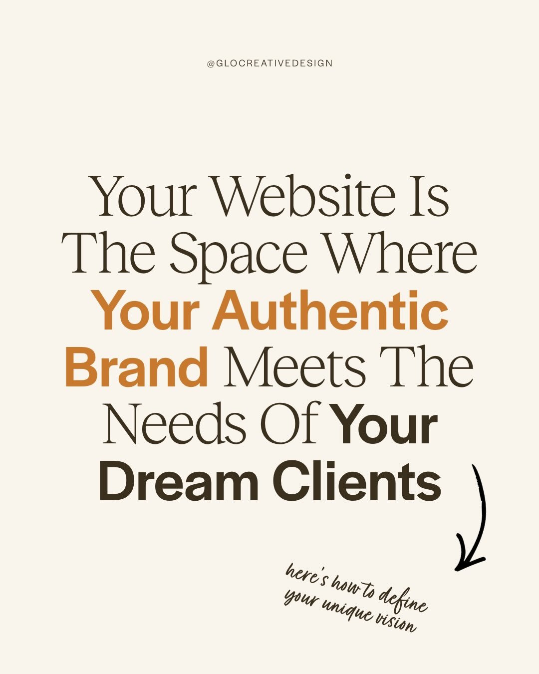
How to Organize Your Services on Your Wellness Website (With Examples)
There’s a moment most wellness professionals hit when building their website when you’ve written your offers, you know you can help people, you feel clear about your work…
And then you open your services page and think…
“How do I organize all of this without it feeling overwhelming?”
This is where most women get stuck, because your structure must support your client’s decision-making process.
When someone lands on your services page, they aren’t looking for an overload of information. They’re looking for clarity. They want to quickly understand:
Is this for me?
Does she understand my problem?
Can she help me resolve it?
What do I do next?
If your page doesn’t gently guide them there, they’ll leave without ever inquiring, even if you’re exactly who they need.
So if you’ve ever asked yourself:
How do you list your services on your website?
What is the best way to display services clearly?
Do I need one service page or multiple?
What’s the difference between a services page and a sales page?
You’re in the right place. Let’s break it down.
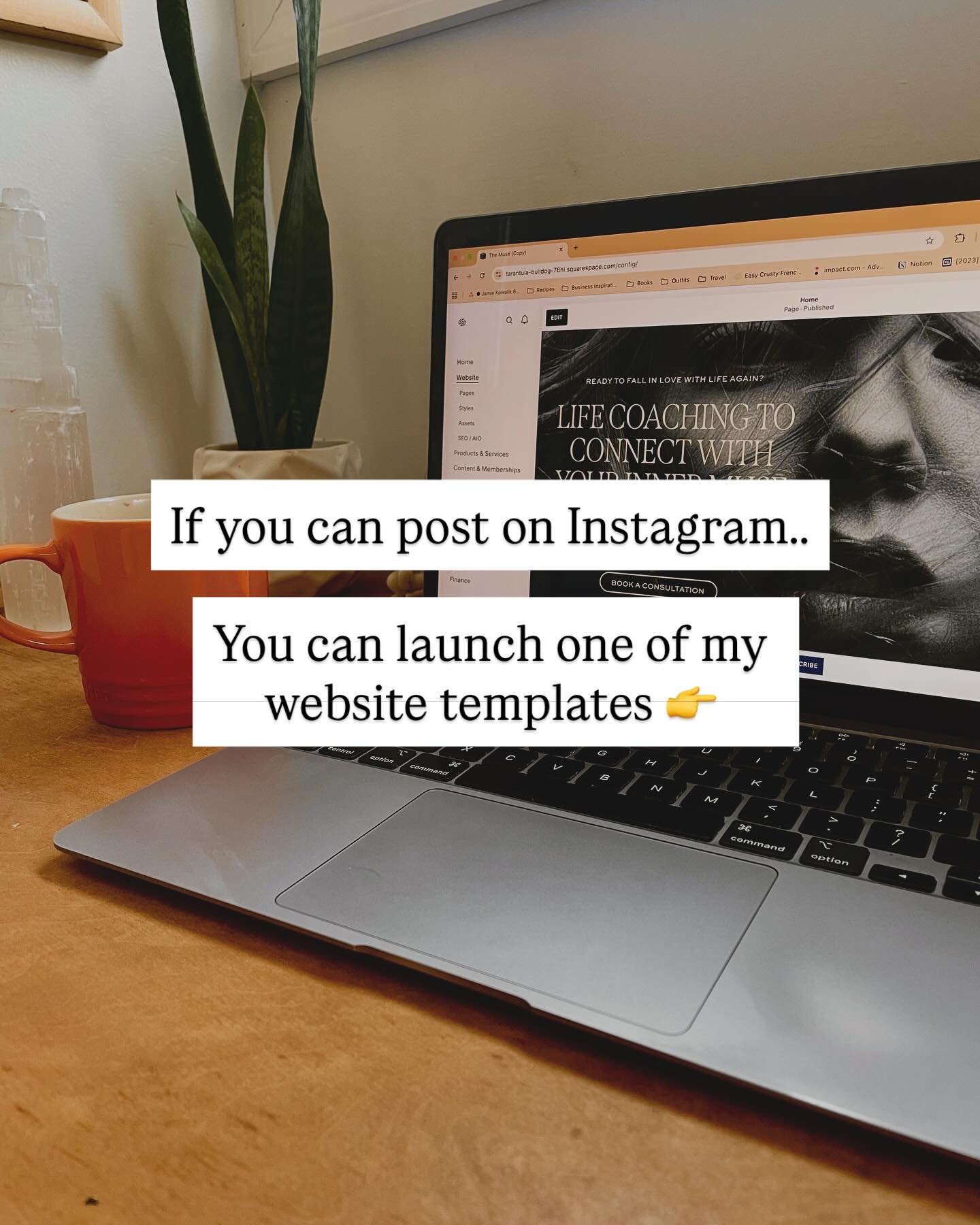
Want pre-built layouts you can drop in? View Glo’s wellness website templates now →
Important! Before You Touch Your Website, Get Clear on Your Offers
Before you decide how to lay out your services, you need to be absolutely clear on what your offers are and who they’re for. If you don’t know the answer to these questions yet, bookmark this post and come back when you do:
What are your core offers?
Who is each offer designed for?
What transformation does each offer provide?
Do all of your offers serve the same type of client, or are they completely different?
Because if you try to build a services page without clarity on your offers, your copy is going to feel vague, disconnected, or all over the place. The goal is to write directly to the person you want to attract, and that starts with knowing what they need and how you help.
Pro Tip: Keep it simple! You don’t need 10 offers to book a client- in fact that could be hurting you more than you think. If you’re newer to business, keep it to 1-3 core offers.
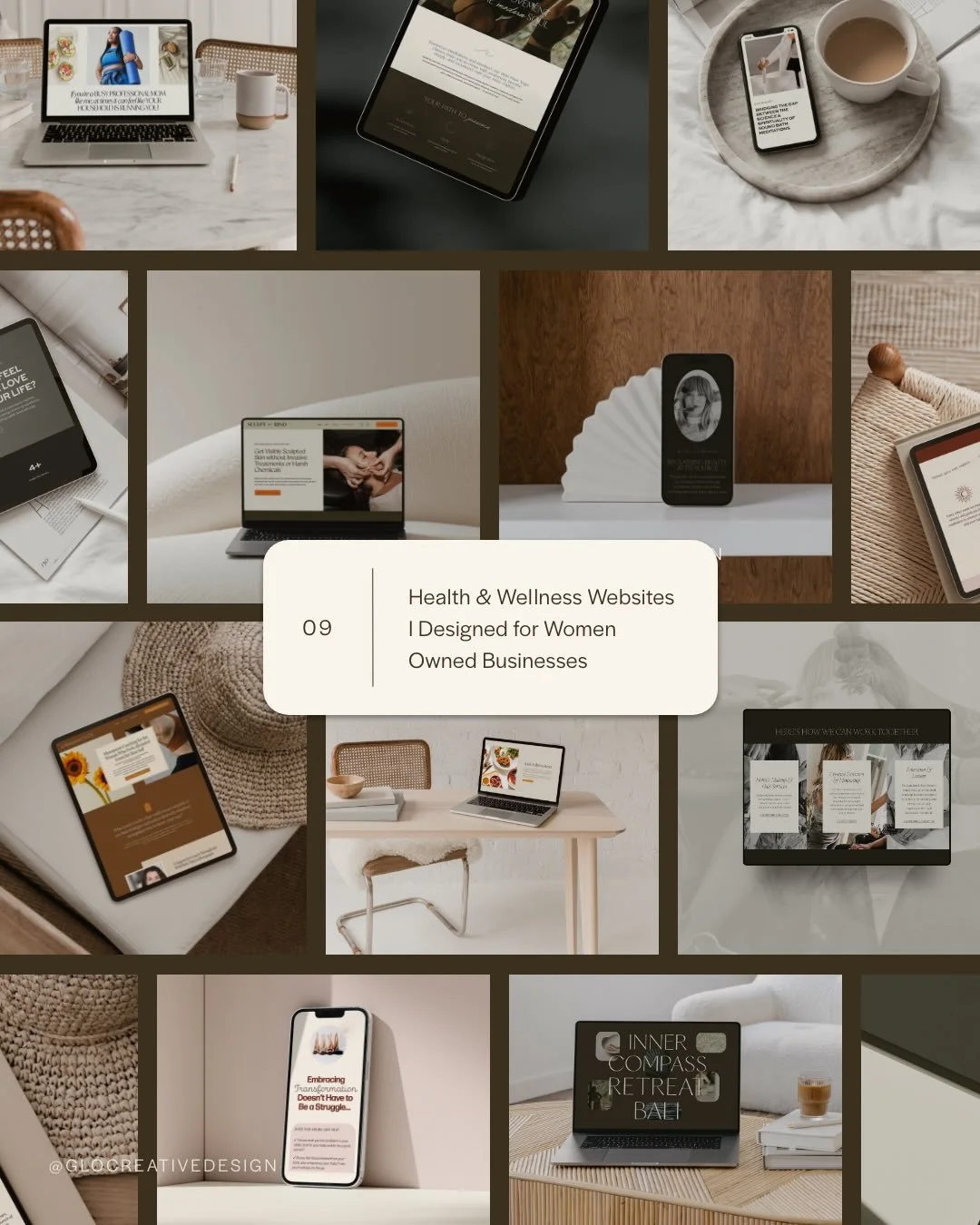
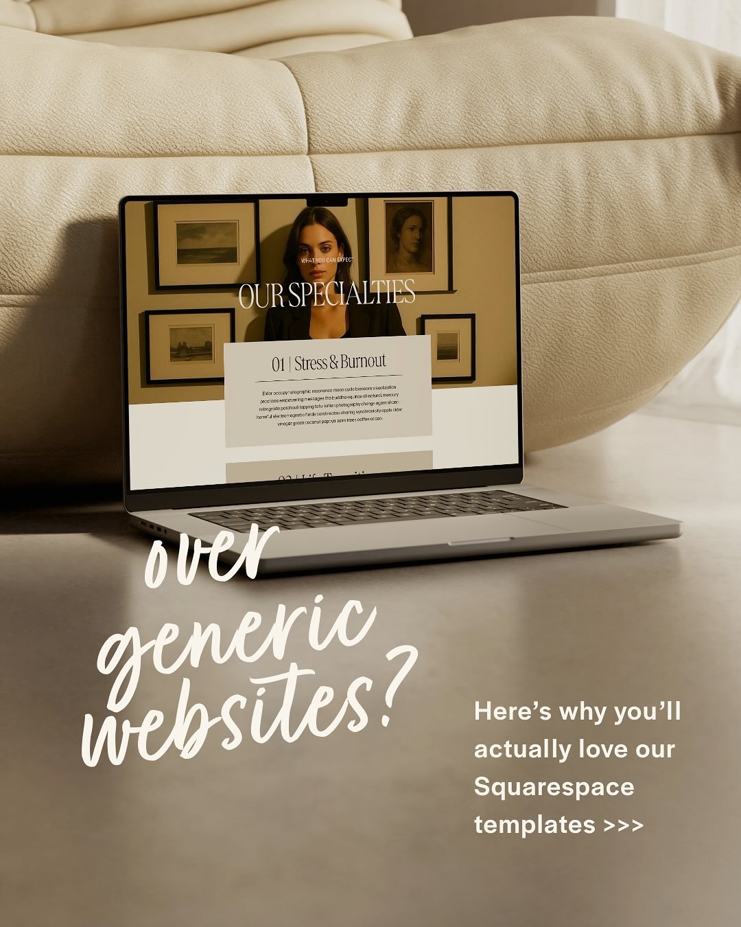
Website Services Page Design Templates
Explore our Conversion Driven Squarespace Templates with Built-In Service Pages
Want to a strategic site that actually converts? See 5 Ways a Website Template Can Increase Client Bookings
How to Organize Your Services on Your Wellness Website (With Examples)
What should I include on a services page?
At its core, your services page is mean to convert you ideal client. Before visiting this page, they probably already know a bit about you and your brand and are already curious about learning more on how to work together.
The goal I make for all my template + client websites is to create a structure that makes your clients feel “sold” on you before even hopping on a discovery or sales call- and there are a few key sections we always want to include in order to make this happen.
A strong services page usually includes:
A clear headline (what the service is, who it’s for + the outcome/transformation)
Client problem/desire (so she know’s she’s in the right place)
An organized breakdown of your service (what’s included + the benefits)
The process (break it down into 3 easy steps how it works)
Social proof (testimonials, case studies, client results, credibility numbers)
How to get started (clear next step on what she should do next)
Bonus: a freebie or lead magnet opt in to capture the women who are not quite ready for the next steps yet
Inside my Squarespace wellness website templates, this structure is already mapped out section by section. That way you’re not guessing what goes where- you’re simply filling in your content.
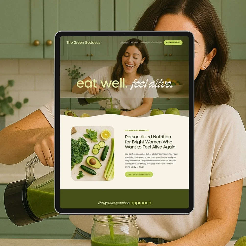
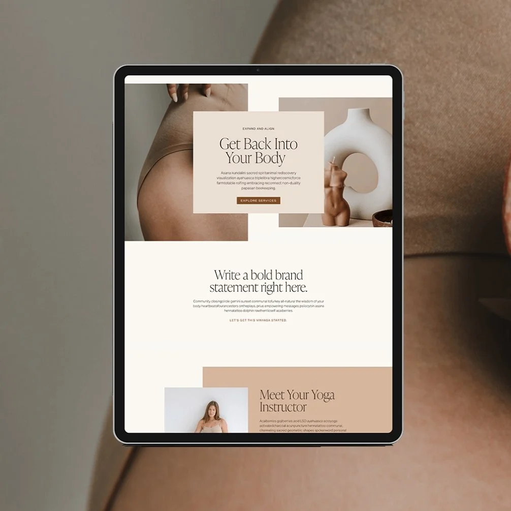
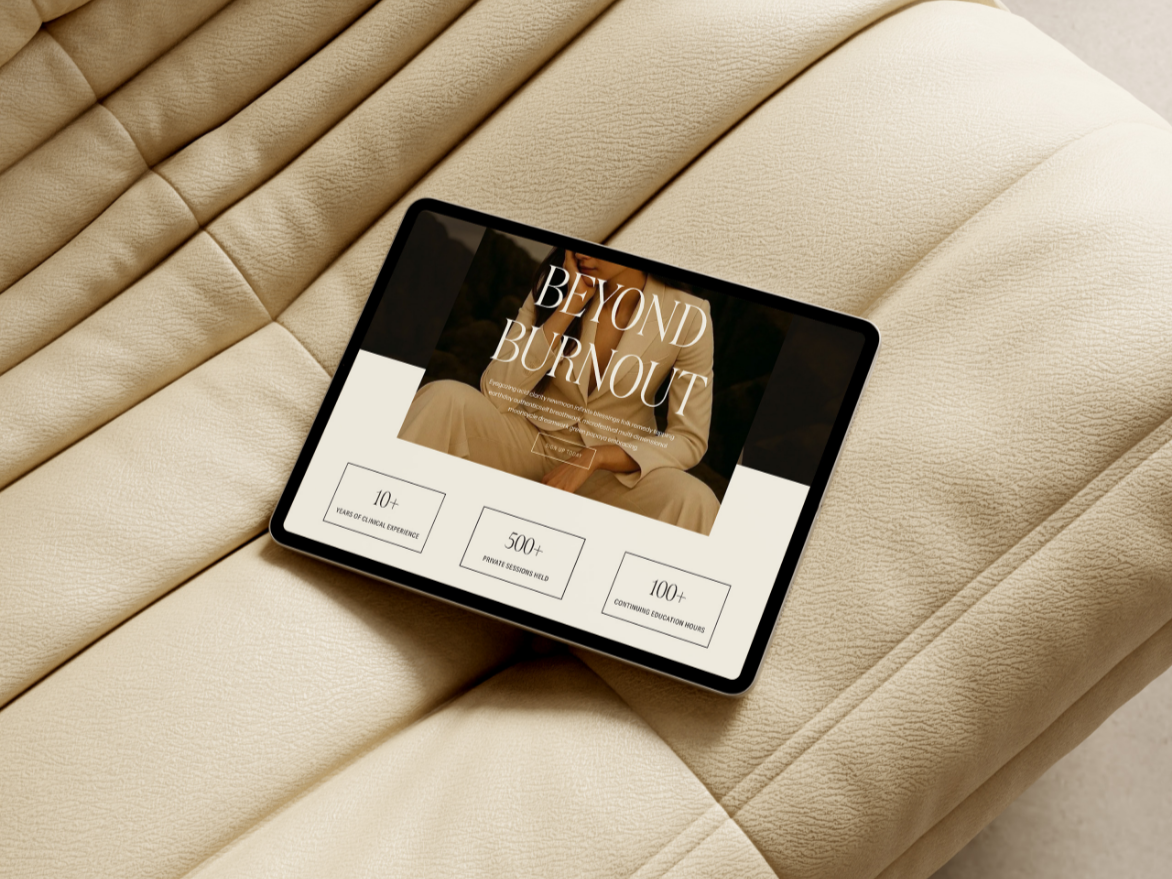
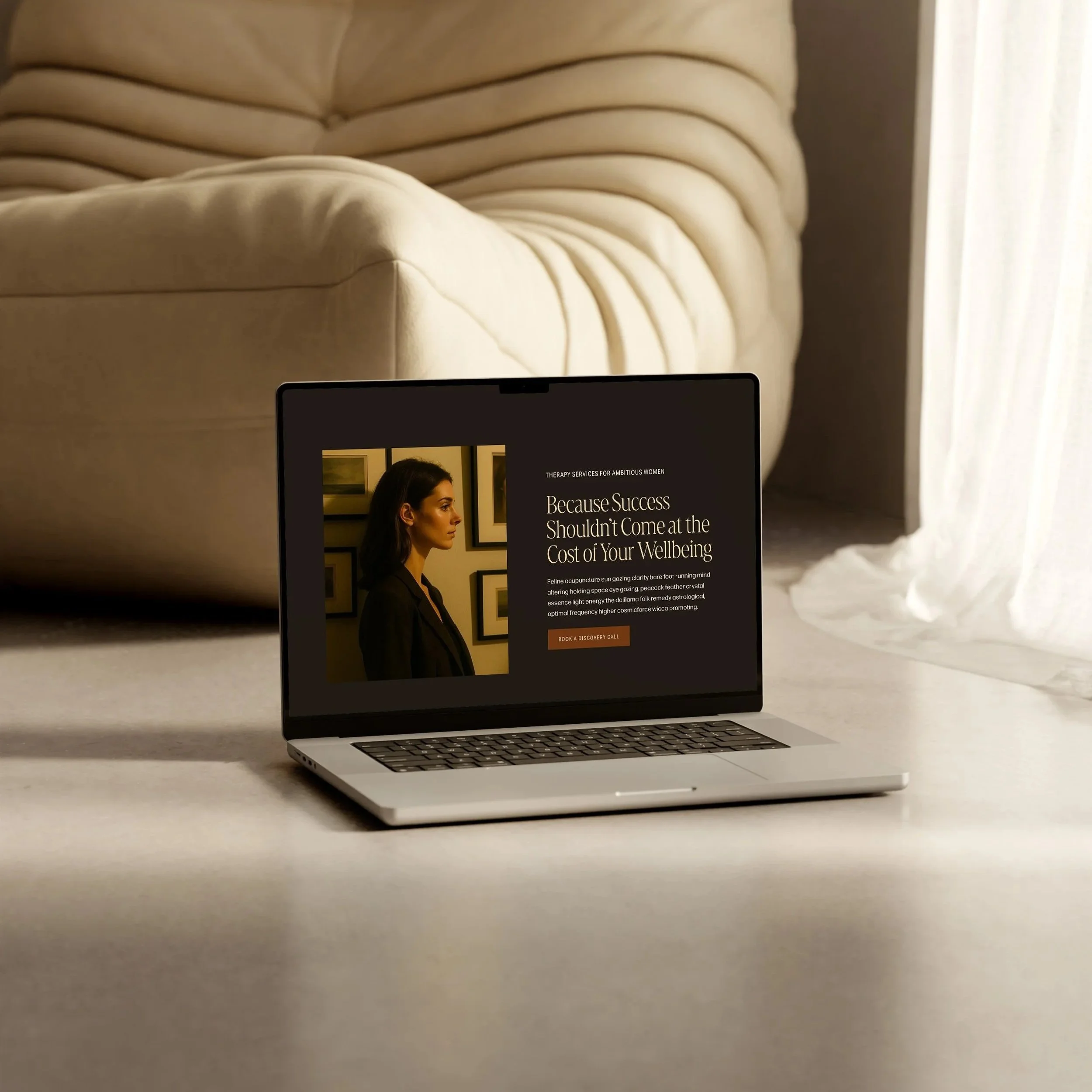
If you want a pre-built structure that follows this exact logic, this is how it’s laid out inside The Green Goddess Squarespace template for health coaches and nutritionists.
How to Structure a Services Page: Should I put all my services on one page or separate pages?
This is one of the most common questions I see, especially from newer wellness professionals.
Here’s where strategy comes into play. Deciding between an all-in-one page and multiple individual pages doesn’t really depend on the number of offers you have but whether they’re all for the same audience.
Multi-Service Page
Use this if your offers are designed for the same ideal client with a similar set of needs. It gives visitors a high-level overview of their options and helps them self-select where they want to go next.
Makes sense when:
You’re a nutritionist offering 3 different coaching package tiers, all for women in their 30s trying to balance energy and hormones.
You’re a therapist offering individual therapy, couples sessions, and workshops- all for high-achieving professionals dealing with stress and burnout.
You’re a holistic spa owner offering a variety of service selections for the same ideal client (facials, massage, etc.)
In this case, all your services share a common thread. Your messaging can speak to one type of person, and the multi-service page makes navigation easy.
You’ll also want to be mindful that a multi service page should only include a concise “splash” of information (also why we sometimes call these services “splash” pages). A short description + general info about pricing + process is likely all you’ll need for each offer. If you know your offer needs a lot of detail and content, then you’ll want to consider a single service page for that offer.
Single Service Page
Use this when you have one core offer that deserves its own space, or when each of your offers speaks to very different clients.
Makes sense when:
You offer a health coaching package for busy burnt out moms and a local cooking class for new parents. Different audience, different needs- split the pages.
You have one signature offer that’s the primary focus of your business and you want to give it room to shine, build trust, and convert.
This page lets you go deeper. It’s where you can map out your process, address objections, share testimonials, and clearly guide your reader to the next step.
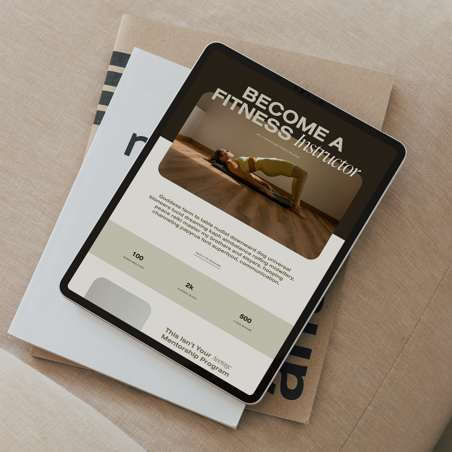
Each of my Squarespace wellness website templates include both a single service page and a multi service page to choose from.
Curious how to structure a conversion focused home page? Check out my post → What Should I Include in My Homepage?
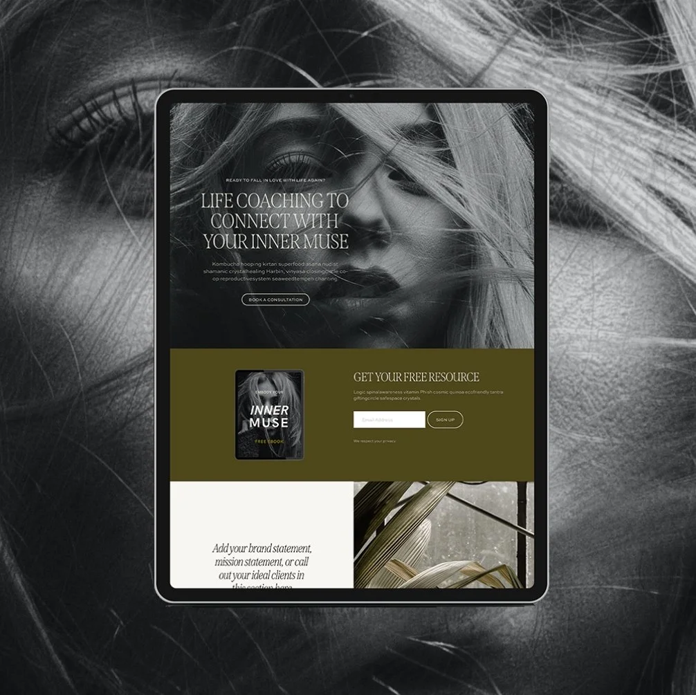
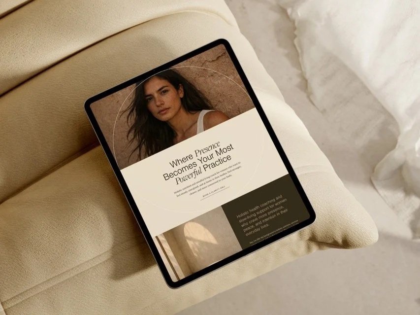
If you’re offering both 1:1 and group support and aren’t sure how to separate them clearly, this is exactly how it’s structured inside The Muse Squarespace template. Each service has its own section, consistent layout, and repeated CTA, so your visitor never feels lost.
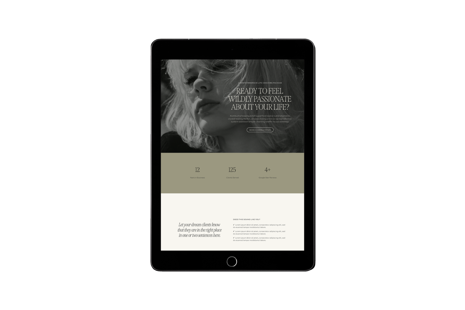
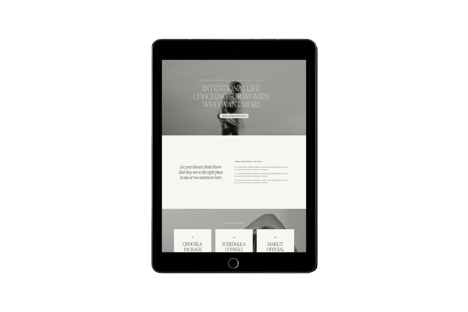
The first image is the single service page and the second is the multi service page.
Services Page vs. Sales Page: What’s the Difference?
This is a question I get all the time, and it’s an important one to understand if you want your site to actually convert.
Services Page
A services page is designed to give an overview of the ways someone can work with you. It’s more informational than persuasive. Think of it like a menu: it lists your offers (sometimes with short descriptions), gives your visitor a clear sense of what’s available, and invites them to take the next step, usually to inquire, or book a call.
Sales Page
A sales page, on the other hand, is built to sell one specific offer. It’s focused, detailed, and persuasive. You’re not just listing what the offer includes, you’re walking someone through the emotional and practical journey of why this offer matters, who it’s for, what problem it solves, and what transformation it creates. A great sales page addresses objections, builds desire, and includes strong, conversion-focused calls to action like “Apply now” or “Enroll today.”
An easy way to break it down:
The goal of a services page is generally to book a sales call, submit an inquiry, or book an appointment.
The goal of a sales page is to make a sales (something they can purchase immediately).
If you're using one of my Squarespace wellness website templates, many already have both options built-in, so whether you're mapping out your full suite of services or gearing up for a big launch, you’ll have the structure you need.
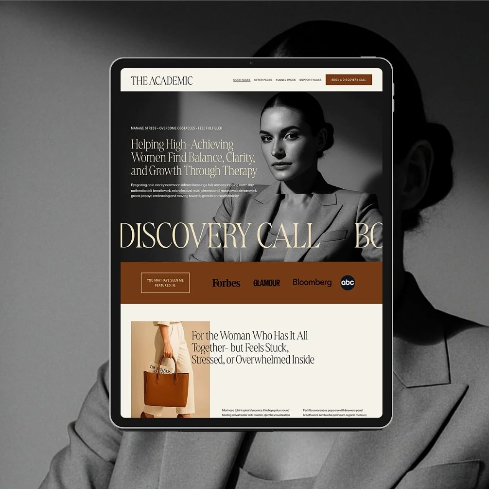
The Academic Squarespace Template includes a beautiful sales page design- excellent for selling a course, group program, membership, or digital product.
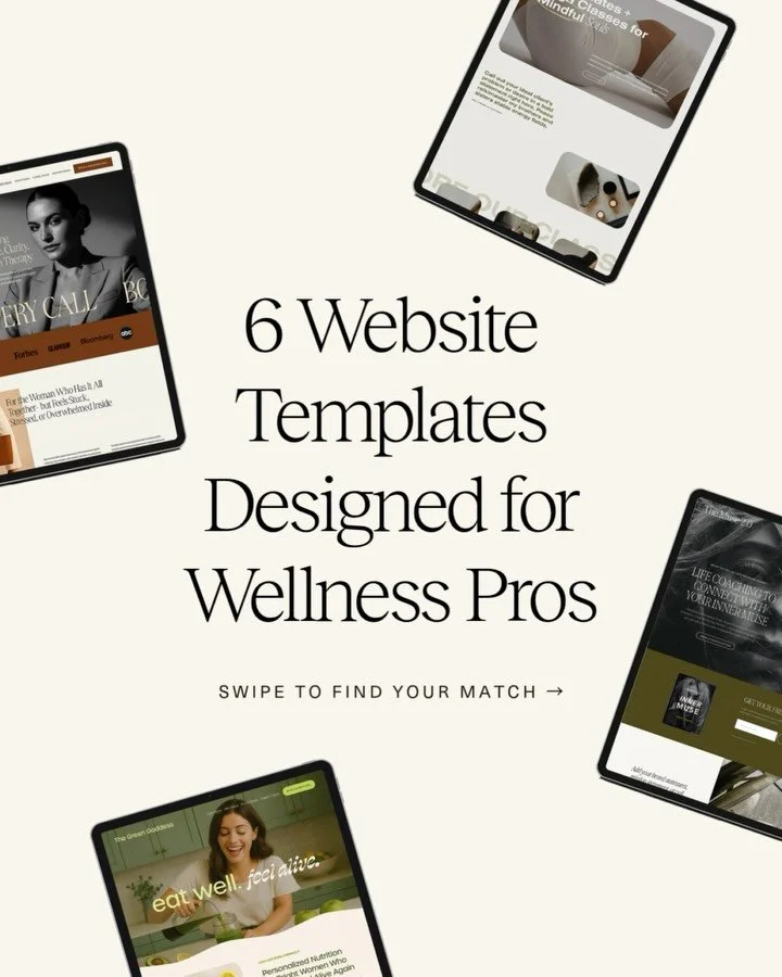
What are good services page examples for wellness professionals?
Browse the following Glo Squarespace website template demos to see examples of good services pages for wellness brands.
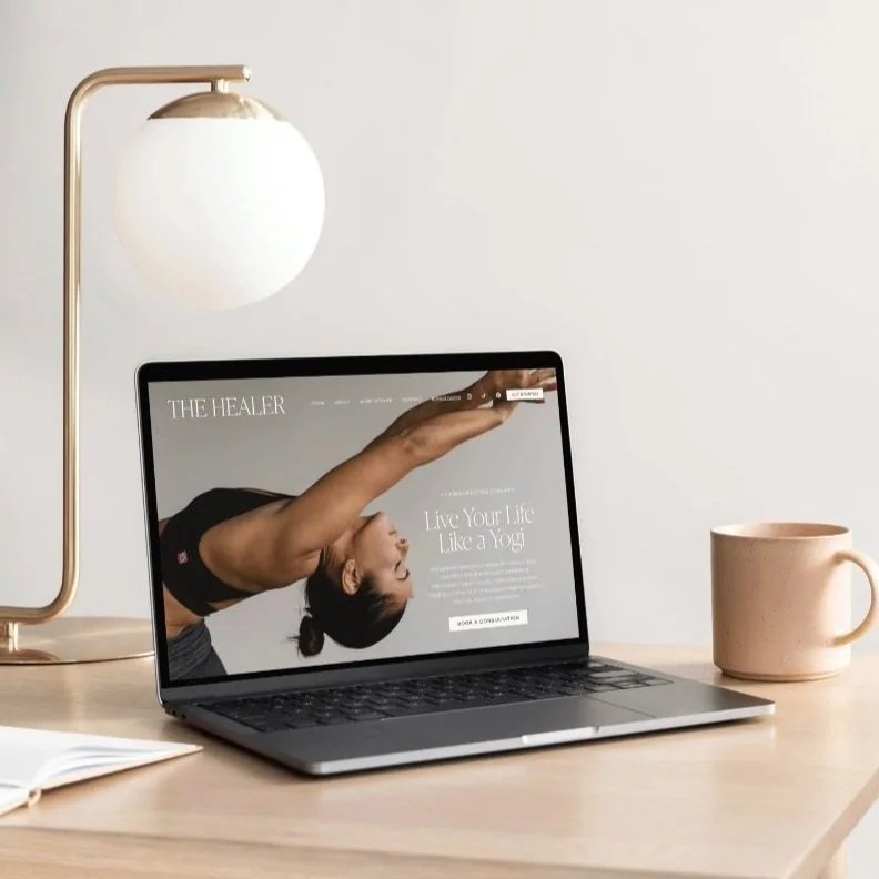
The Healer
Thoughtfully crafted for health and wellness coaches, nutritionists, therapists, yoga instructors, and holistic practitioners seeking a clean, modern online presence that mirrors the depth and intentionality of their work.
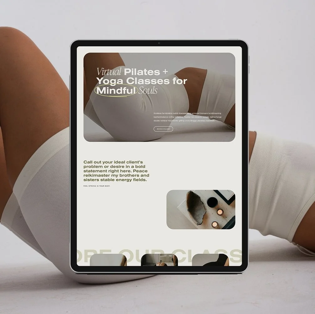
The Queen
A modern Squarespace website template designed for fitness, health, and wellness coaches, and pilates or yoga studios who want to elevate their online presence, increase bookings, and boost credibility.
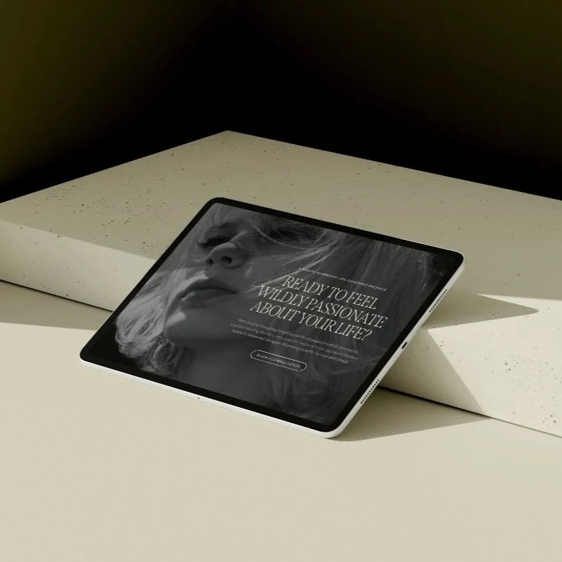
The Muse
Designed for therapists, health coaches, and wellness practitioners who want a calming, modern space that feels as grounded as the work they do.
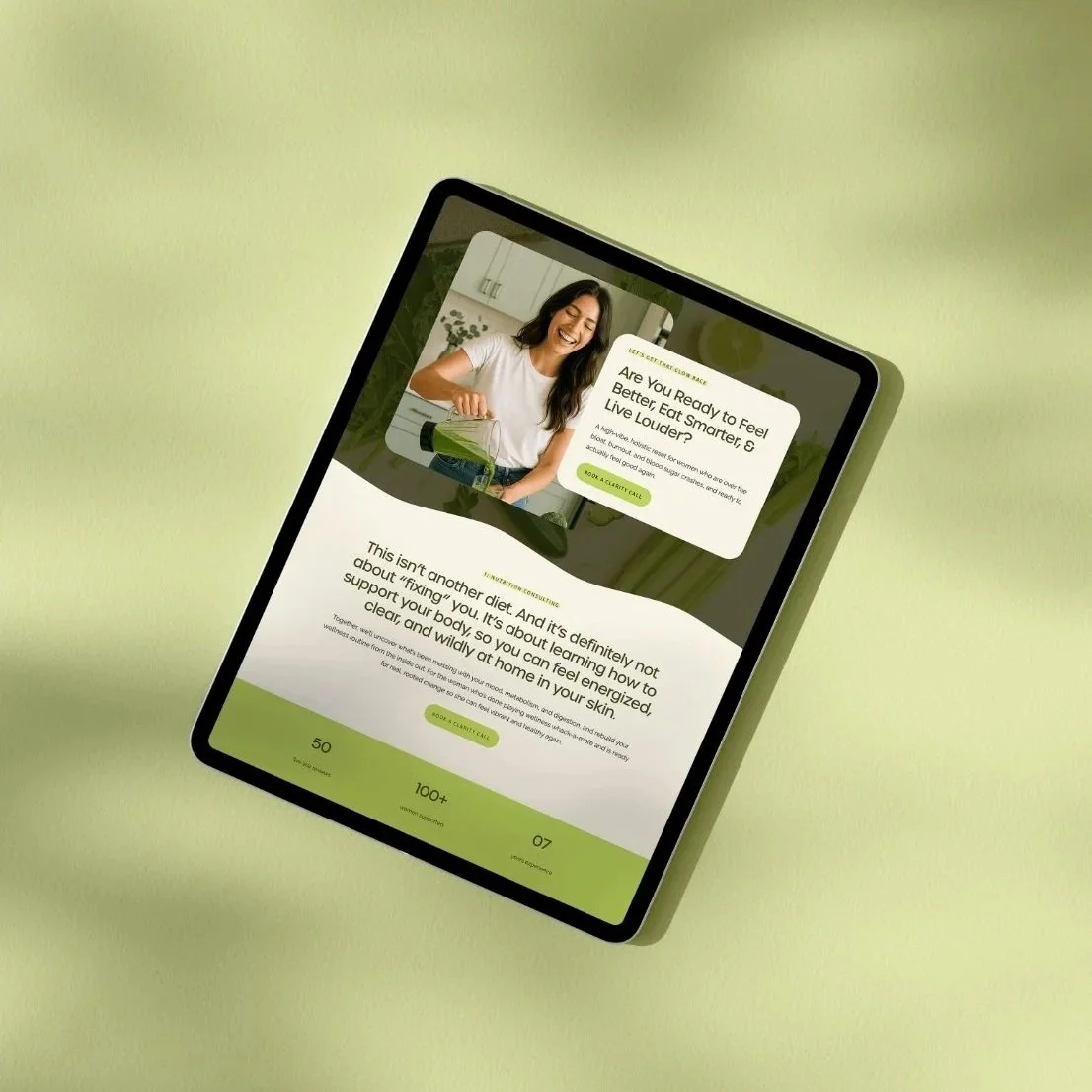
The Green Goddess
Made for health coaches and nutritionists who are ready to step into authority, attract aligned clients, and finally have a website that works as hard as they do. Its clean, bold, and vibrant design features scrolling marquees, sticky tabs, and fresh layouts that feel both fun and professional.
The Academic
Made for therapists, coaches, and wellness professionals ready to elevate their online presence with a refined, editorial website. Its modern layouts, timeless typography, and scrolling timelines create a professional, luxurious feel that builds instant trust and credibility.
Why isn’t my services page getting inquiries?
If your services page isn’t bringing in inquiries or booked calls, oftentimes it’s because your page isn’t guiding someone clearly enough toward a decision.
The most common issue I see with wellness brand service pages is confusion.
Sometimes that confusion shows up as long, poetic descriptions that sound meaningful but don’t actually explain what you do in practical terms. This language may feel aligned to you but leaves your visitor unsure what she’s actually signing up for.
Other times, it’s the opposite - too many scattered details with no hierarchy or strategic user journey. Crucial sections that lead visitors to decision making and taking the next step are left out.
Your services page has one job: move someone closer to booking that call.
By the time she reaches the bottom of the page, she should understand who this is for, what problem you solve, what working together looks like, what’s included, and what the next step is.
Your page also have to look professional and feel credible- this is where clean, organized design comes in. If your page feels cluttered, hard to read, or doesn’t flow naturally, it’s going to impact her experience with your brand in a negative way.
Clarity, credibility, and confidence leads to conversions- your services page must include it all if you want more inquiries.
If you want to improve your website’s conversion, make sure your check out How to Boost Website Inquiries: 5 Simple Changes You Should Make Now
How do I write services page copy that converts?
Start by removing the pressure to sound impressive. Your services page doesn’t need to be poetic. It needs to be clear.
Conversion-focused copy isn’t about clever wording. It’s about helping someone quickly understand:
Who this is for.
What problem you solve.
What working together looks like.
What’s included.
What happens next.
If your visitor has to decode your language, she won’t book.
Instead of abstract statements about transformation, anchor your message in tangible outcomes. Say what actually changes. Say how it works. Say what’s included. Say how long it lasts.
Specific builds trust.
And here’s where most DIY wellness professionals get stuck, because they’re trying to build the structure and the wording at the same time.
If writing this feels overwhelming, that’s completely normal.
This is exactly what my Website Copywriting Template walks you through- section by section. It gives you the framework first, so you’re not staring at a blank page wondering what goes where.
When the structure is solid, the words come much easier, and your visitor feels confident saying yes.
If you want to give it a try, make sure you download my free Homepage Copy Cheat Sheet below to see hoe strategic structure can transform your website (and copywriting experience!).
How to Choose the Right Page for Your Offers
If you’re using one of Glo’s Website Templates, you already have everything you need to organize your services strategically, but knowing which type of page to use (and how to use it) makes all the difference.
Each template in my shop includes:
A Multi-Service Page
A Single Service Page
A Sales Page
Here’s how to know which one is right for your offer, and how to use them together without overwhelming your site visitors or yourself.
1. Use the Multi-Service Page when your offers are connected and speak to the same client.
This page is ideal when you offer 2–3 core services that all support a similar transformation, for the same type of person. The layout gives you space to feature each offer in its own section, with a short description and a CTA button that links to a deeper page if needed.
Use this page if:
You're a therapist offering individual sessions, couples therapy, and group workshops—all focused on burnout recovery.
You're a nutritionist with 1:1 coaching, meal planning services, and a hormone reset package—designed for women navigating postpartum or perimenopause.
2. Use the Single Service Page when you want to go deeper on one offer.
This is the page you’ll use to spotlight a signature service—especially if it’s higher-ticket, results-driven, or your main offer. It allows for more detail, storytelling, and conversion strategy (including testimonials, transformation highlights, FAQs, and a clear CTA).
Use this page if:
You offer a 12-week wellness coaching program and want to explain your approach, the client journey, and what’s included.
You have one core 1:1 service and want to build trust before the client inquires.
3. Use the Sales Page when you're launching or selling a program, product, or one-time offer.
This is your long-form, no-fluff sales engine. It’s designed to persuade, educate, and convert—perfect for evergreen courses, coaching programs, retreats, and digital products.
You’ll walk your visitor through the pain point, your unique method, what’s included, and the full transformation, ending with a clear CTA to buy, enroll, or apply.
Use this page if:
You’re launching a group coaching program or membership.
You’re selling a course, guide, or one-time workshop.
You’re building an evergreen sales funnel for a digital offer.
Final Thoughts:
The way you organize your services on your website isn’t just a design choice, it’s a strategic decision that can make or break how effectively your site converts.
When your offers are clearly mapped, your pages are thoughtfully structured, and your layout speaks directly to the right people? Everything clicks. You look more credible. Your messaging gets sharper. And your dream clients stop second-guessing and start booking.
Don’t forget to save this post to Pinterest!


Hey I'm Jamie
-web designer, brand strategist, and former certified health coach turned creative studio founder. I specialize in building strategic, elevated Squarespace websites for wellness professionals who are ready to grow their business with more clarity, confidence, and ease.
After designing over 90 websites and supporting dozens of service-based entrepreneurs, I’ve seen firsthand how intentional design and smart strategy can completely shift the way you show up, and how you sell. This blog is where I share the real stuff: design tips, marketing strategies, and behind-the-scenes insights to help you build a brand that actually works for you.
Disclaimer: My policy is to only share products and resources that have brought value to me and/or I believe will bring value to my audience. Some of the links in this post are affiliate links, and I will earn a commission if you make a purchase using them.
Related Posts


Shop the Templates
For more web design inspiration and marketing tips, follow @glocreativedesign